Context
Riders of Public Transit Victoria’s (PTV) use myki cards to access the regions trains, trams, and buses. Riders had been complaining about how hard it was to use the automated ticketing machines (CVMs) to “top-up” (add money or time) to their cards.
I conducted research, design, and testing sprints to redesign the myki kiosk UI to make it easier for riders to buy new cards or add money to existing cards.
My role
Scoping
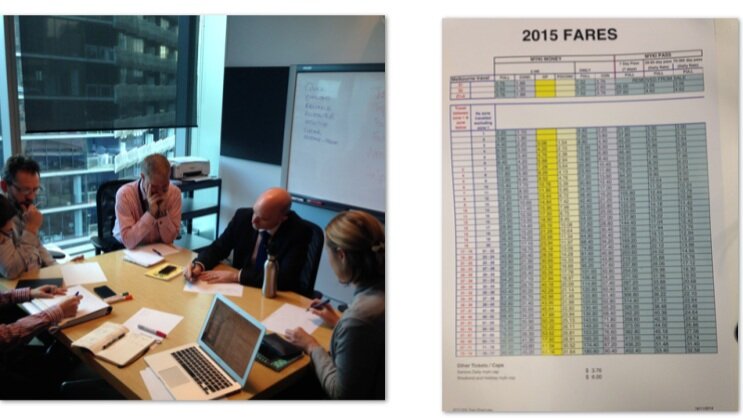
I worked with PTV stakeholders to understand their goals for the redesign, insights and pain points related to the current design, as well as requirements and constraints of the underlying ticketing system.
Rider Research
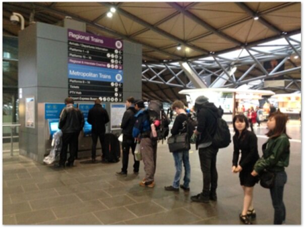
I undertook a ”quick and dirty” research initiative to understand PTV riders’ experience using myki kiosks – this included “in-the-wild” observations as well as one-on-one think-aloud sessions. I also spent a day listening in and observing at the PTV customer service center.
Stakeholder workshops and a deep dive into the ticketing system backend helped me understand the experience from the inside out.
Observations and intercept testing with transit customers help me understand pain points with the current experience.
Insights
For frequent users familiar with CVMs, the interface is “goodenough”
Infrequent users and frequent users who top-up other ways are easily lost when asked to perform simple tasks on CVMs.
Content throughout the device is not presented in a way that creates an intuitive work flow for the user
CVMs can be better utilized to communicate pertinent information to users
Decals can be better utilized to facilitate successful use of CVM
Design
Working with our product designers, I designed a new and improved UX and UI that utilized a high-contrast color scheme, with large buttons, plain language content, and clear user prompts and calls to action.


